sami iyengar

Driving Mode Interface
A redesigned, research-based touchscreen for safer in-car interaction
Timeline: 20 weeks (January to June 2026)
Role: UX Research, Interaction Design, Storyboarding, Wireframing, Prototyping, User Testing
Tools: React/TypeScript, CodeSandbox, Vercel, Procreate
The Problem
TOUCHSCREENS HAVE TAKEN OVER CARS
Modern vehicles have consolidated nearly every critical function, from navigation to windshield wipers, into a single central touchscreen display.
While these may look sleek and technologically impressive, they also introduce serious safety tradeoffs: they require drivers to look away from the road in order to locate and utilize a control.
No tactile feedback: Unlike physical controls, touchscreens offer no way to operate by feel. Every interaction requires visual confirmation.
Complex multi-step flows: Simple tasks like adjusting wiper speed or activating the defroster can require navigating menus and multiple taps.
No spatial consistency: Controls constantly shift, hide, and reorganize, making muscle memory impossible to develop.
THE SOLUTION?
Touchscreens aren’t going anywhere; though automakers are slowly reintroducing physical controls back into vehicles, touchscreens remain cheaper and easier to implement.
In this project, I wanted to create a focused “Driving Mode” touchscreen interface that reduces visual attention demand, without removing the touchscreen entirely.
The Research Behind It
It started with a question:
Are touchscreen vehicle interfaces associated with increased visual distraction while completing common driving-related tasks?
I conducted an empirical study to answer exactly that by comparing touchscreen and physical control vehicle interfaces across six common driving tasks, measuring how often and how long participants looked away from the road¹ while completing each one.
The results were clear: touchscreen interfaces required significantly more visual attention across nearly all metrics.
~2.8× more glance deviations
12× more long glances
~6.2× more total eyes-off-road time
15× more NHTSA violations
Touchscreen participants averaged 32 total glances away from the road. Physical control participants averaged 11.5.
Touchscreen participants averaged 12 glances exceeding the NHTSA’s 2-second safety threshold.² Physical control participants averaged only 1.
Touchscreen participants accumulated an average of 95 seconds of total gaze deviation across all tasks, compared to 15.25 seconds for physical control participants.
Combining single glances over 2 seconds and tasks exceeding the 12-second cumulative threshold, touchscreen participants recorded an average of 15 total violations.
Physical control participants recorded an average of 1.
PARTICIPANTS FELT IT TOO
Touchscreen users rated their perceived safety a 2 out of 5, while physical control users rated theirs at a 4-5 out of 5. Touchscreen users also rated the interface’s visual demand as a 4-5 out of 5, while physical control users rated theirs at a 2-3 out of 5.
No participant across either group said they would prefer a touchscreen-only interface.
WHAT THIS MEANT FOR MY DESIGN
These findings pointed to specific, addressable problems: the absence of tactile feedback, inconsistent control placement, and interaction flows that demanded too many steps and too much visual confirmation.
The next step was turning those findings into design requirements.
¹ “The road” in this case was a secondary visual attention task.
² The NHTSA (National Highway Traffic Safety Administration) has established visual-manual distraction guidelines recommending that in-car tasks be designed such that single glances away from the roadway do not exceed 2 seconds and the cumulative glance time per task does not exceed 12 seconds. These thresholds provide an operational definition of “unsafe visual distraction,” and serve as a benchmark for evaluating vehicle interface safety.
From Findings to Design Principles
I translated each major finding from the study into a concrete design requirement so that every design decision had a direct, evidence-based justification.
WHAT THE DATA SHOWED
Touchscreens required too much visual searching
The absence of tactile feedback forced constant visual confirmation
Controls shifted and reorganized unpredictably
Multi-step interaction flows dramatically increased distraction
Touchscreen interface drivers felt unsafe and lacked confidence
Physical controls weren’t perfect either; placement and labeling matter
WHAT THE DESIGN NEEDED TO DO
Minimize the number of steps and visual confirmations required to complete any interaction
Support muscle memory and spatial awareness so drivers can interact without looking
Keep all controls in fixed, stable positions that never move
Reduce every interaction to the smallest number of steps possible
Ensure critical system statuses are always visible so drivers never have to wonder whether an action worked
Design control placements to align with existing driver expectations and mental models
A NOTE ON SCOPE
One of the earliest decisions was to deliberately limit what appears on the screen while in Driving Mode, in order to remove potential sources of distraction. Rather than designing a full infotainment system, Driving Mode surfaces only the controls drivers actually need while in motion; everything else appears when the vehicle is parked.
Concept Exploration
I explored three different concepts, each of which approached the core problem differently. I created a storyboard for each one, then collected feedback from 11 participants to understand which ideas resonated and which raised concerns.
CONCEPT 1: PHYSICAL BLOCK-BASED LAYOUT
CONCEPT 2: DIFFERENTIATED HAPTIC FEEDBACK
CONCEPT 3: MULTI-SCREEN DISPLAY

When the vehicle starts moving, physical dividers emerge from the touchscreen surface, dividing it into fixed zones, with each zone corresponding to a specific function. When parked, the dividers recede and the full interface returns.
PARTICIPANTS LIKED:
The potential for quick learnability and muscle memory development in a way that normal touchscreens don’t allow. Clear visuals on each block are helpful in distinguishing them.
PARTICIPANTS WERE CONCERNED ABOUT:
Confusion if Driving Mode layout is too different from the regular interface.

Different controls produce distinct haptic patterns, so drivers can eventually distinguish the various ones and operate the interface entirely by feel.
PARTICIPANTS LIKED:
Potential for learnability over time as drivers build associations between feedback patterns and specific functions.
PARTICIPANTS WERE CONCERNED ABOUT:
This generated the most concerns out of the three concepts. Overcomplexity, the time required to learn the associations, the forgettability of haptic compared to tactile feedback, driver distraction, and the risks of trial-and-error learning while actively driving were some of the frequently raised issues. One participant pointed out that haptic feedback only confirms an action after it has already been attempted, which is less useful for preventing mistakes in the first place.

A second screen behind the steering wheel keeps navigation, speed, and other important system statuses directly within the driver’s line of sight, while the center console handles all interaction inputs.
PARTICIPANTS LIKED:
Critical information stays within the driver’s natural sightline without requiring them to look away. Several described this as the most intuitive, usable, and frictionless of the three concepts, and the one that best matched their existing mental model of vehicle interfaces.
PARTICIPANTS WERE CONCERNED ABOUT:
The screen changing automatically without the driver’s input.
No single concept fully solved the problem on its own. The multi-screen system was the most preferred, but the physical blocks’ potential for muscle memory was too valuable to leave out, and even the haptic concept contributed something useful: the idea of simplified, generalized confirmation feedback, rather than complex differentiated patterns.
The final design combined all three.
Key Design Decisions
REAL PHYSICAL DIVIDERS
In the production version of this interface, the physical dividers extend above the screen surface as raised physical elements, so that the driver can feel their way to the correct zone without looking.
SIMPLIFIED HAPTIC FEEDBACK
Though this concept generated the most participant concerns out of the three, the underlying value of non-visual confirmation was real. The solution, then, was to simplify: rather than distinct patterns for each function, the final design uses a single consistent haptic pulse for general action confirmation.
STATUS ALWAYS VISIBLE ON STEERING WHEEL DISPLAY
A key finding from the original research study was that drivers experienced confusion or hesitation whenever they couldn’t confirm if an action had worked without having to look away from the road. The steering wheel display directly addresses this: active states for the defroster, defogger, headlights, volume mute, and climate are always visible within the driver’s direct sightline.
TAP ZONES TO MINIMIZE PRECISION
Early feedback flagged that sliders require too much precision, which is a fair concern, especially when actively driving and navigating traffic. However, removing the sliders entirely would require drivers to tap through multiple states, one at a time, to reach their desired level. The solution was “tap zones”: large invisible regions included at the top and bottom of the slider-controlled blocks, which can step the slider up or down with a single tap anywhere in that area.
DEFROSTER/DEFOGGER STRUCTURE
The original low-fi split the defroster and defogger into separate sides of one block. This was changed in the mid-fi to reflect how these controls actually appear in real vehicles, with front and rear icons side by side and the ability to toggle between the defroster and defogger states.
OPTIONAL TUTORIAL
The high-fidelity test participants noted that the interface made sense after some use, but seemed to require a bit of initial knowledge to get started. In response to this feedback, an optional 5-step interactive tutorial was added, walking users through the two screens, the toggling system, the tap zones, the SOS button, and the status chips.
Wireframe & Prototype Progression
LOW-FIDELITY
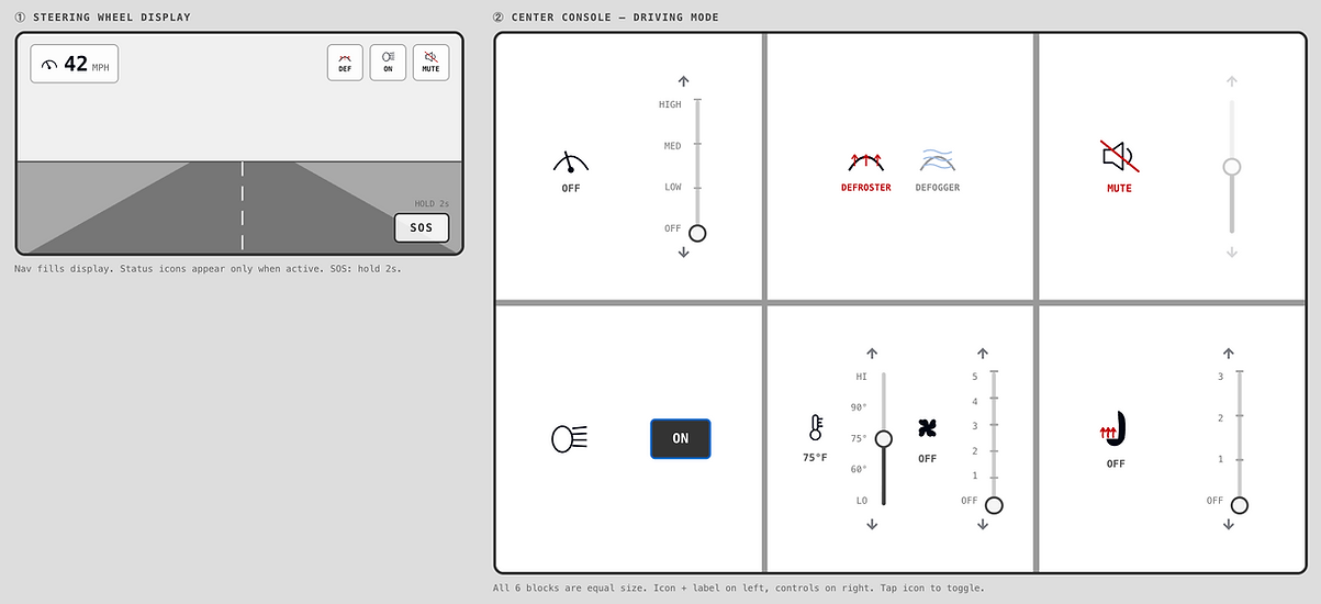
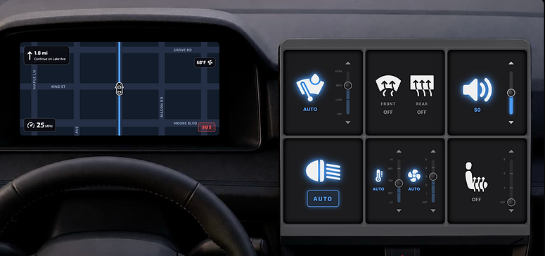
Built through vibe coding with Claude AI, the low-fidelity prototype focused entirely on structure, establishing the six-block layout, the dual-screen system, and the core interaction patterns that carry through the entire design: icon on the left to toggle, sliders on the right to adjust, and status updates on the steering wheel display.
FEEDBACK AT THIS STAGE SURFACED A FEW ISSUES:
-
The windshield wipers and headlights icons were unclear
-
Showing the wiper status on the steering wheel display seemed redundant, as drivers can already see the wipers through the windshield
-
Having both standalone up/down arrows and a slider for the same control felt inconsistent and potentially confusing
CHANGES MADE GOING INTO MID-FI:
-
Replaced ambiguous icons with clearer, realistic alternatives
-
Swapped wiper status for volume mute status on the steering wheel display
-
Standardized all adjustment interactions into a single stepped slider with integrated arrows, so there would be no ambiguity about how to interact with a control
MID-FIDELITY

The mid-fidelity prototype introduced visual identity through a dark-mode theme with blue accents, icon glows for active states, typography, and a more realistic map on the steering wheel display.
KEY CHANGES AT THIS STAGE INCLUDED:
-
Switched the defroster and defogger icons to front and rear icons that cycle through states on tap
-
Added an automatic mode for wipers, temperature, and fan, prompted by feedback that these controls should have a default state
-
Added temperature and fan status chips to the steering wheel display so that the current climate state is always visible
-
Added tap zones—large invisible regions at the top and bottom of each block—after feedback that sliders require too much precision while driving
-
Added an “OFF” state to headlights after finding that most vehicles allow manual override of automatic mode
HIGH-FIDELITY
The high-fidelity prototype transformed everything into a polished and more realistic vehicle interface, adding depth through three-dimensional shadows and highlights on the dividers, a fully animated scrolling map on the steering wheel display, speed oscillation to simulate real driving, state transition animations, icon pulses on tap, and an SOS pulse effect while holding.
KEY FINDINGS FROM THE HIGH-FIDELITY PROTOTYPE TEST INCLUDED:
-
Sliders may require more precision and visual attention than ideal, but acknowledged that the tap zones significantly reduced that burden
-
Interface made sense and felt intuitive after some initial use, though a tutorial could help new users get oriented
-
All toggle cycles may require some memory of the state order
-
Consistency and intuitiveness across all controls were appreciated
CHANGES MADE AFTER TESTING:
Added a 5-step interactive tutorial covering the two screens, the toggling system, the tap zones, the SOS button, and the status chips
Reflection
This project gave me the chance to see the full UX research and design process through from beginning to end. I conducted an empirical study, collected and analyzed both quantitative and qualitative data, synthesized those findings into concrete design principles, explored and tested multiple concept directions, and ultimately built a fully interactive, coded prototype grounded in my initial goals. The skills I’ve gained from that process are some that I will carry into every project I work on going forward.